Digital Design
Product Web page
This was a self-initiated project to improve how the company website communicated the benefits of our software. The original design had key information hidden behind tabs. This made for a limited user experience and was not good for effective communication. Development done in conjunction with Product Marketing, with feedback sessions with the Digital and Marketing teams.
Project goals:
1) To increase sales from product webpages by making information more easily accessible
2) To give a wow factor to visitors on the website

Wireframing
Wireframing is a process by which you plan out the most important elements of a web page, and where they should sit (depending on priority). It is important to get agreement at this level before moving on to UI design, as that can be a distraction from what the page is trying to achieve. These wireframes were created and shared using Adobe XD.
The plan was to build the webpage using bespoke widgets, so that some sections could be omitted for certain products, and also so that sections could be rearranged based on data received from FullStory.
Layout decisions
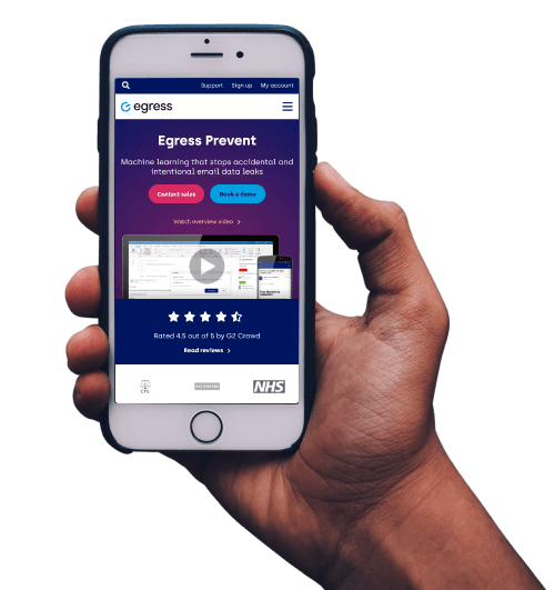
Overall the layout is built so that the most important items sit higher up on the page, with anything priority sitting above the fold. As well as key information and CTAs, I chose to add a video here, as research suggests that including video can increase conversions by up to 85%.
The wireframes for this page look slightly different to the final design, not just due to applied UI design, but also because as the project evolved different product strategies and reprioritisation of resources had an effect. This is not uncommon, depending on the length of the project.
Unique additions
One of the areas which was not included in the final build was the interactive product demo. One of the key areas for the product was its simplicity and usability compared to other cybersecurity products. This area would have been something not before used on the site. I built a working test using Adobe Animate, however due to other priorities the decision was made to forego this feature.
Design for mobile
Too often web designs are created without consideration for mobile devices. This is a serious oversight given how much traffic arrives to websites from smaller screens. Using Google Analytics, even for a B2B company, a significant proportion of visitors were accessing the site using mobile devices. This meant that any UI design for the website needed to include designs for mobile at the earliest stages.


Widget design
Above the fold
This area includes the product name, short description (as customers might not know what the product does from its name) and key CTAs. One of the USPs of the product was its ease-of-use, so this includes product imagery and video. Also included was validation in the form of a 5 star review banner and customer logos. The layout was intended to include a ‘wow’ factor.
Priority areas
Website visitors are unlikely to scroll the full length of the page and are unlikely to read all the content. Key information we want to get across is the benefits and key use cases of the product.
Use case sections are created with large titles for easy scanning, short paragraphs, product imagery that reinforces the text and (where appropriate) links to more information about this topic. These page links are text-only, so they do not compete with the main CTAs on this page.
Underneath the use cases are CTAs which encourage conversion. The main CTA is coloured for attention, any less-important CTA is outlined only.
This section includes limited animations to give the visitor joy as they move down the page (and hopefully encourages them to engage more with the page).
More information
Our research says that video is a very important selling tool, here we show the product in action. This area allows visitors to see how the product works for various use cases. This section also includes a CTA encouraging people to get in touch.
The design for this was deliberately intended not to be another typical boxy video gallery, as this was not desired. The shapes animate on rollover and the text below reinforces that these area video links. When clicked, the video player appears on top of the page, with a 50% opacity dark overlay.
Customer validation
People are more inclined to try a product if they have seen positive reviews or feedback. This section also includes logos of well-known large businesses for validation. This section uses a carousel so that the information is not overwhelming.
Product integrations
This was a key piece of information which customers look for.
FAQs
Other relevant information, such as security certifications. This is tabbed so topics can be easily picked out.
Other products
This product wants to be seen as part of an email security suite. This flowchart shows how these products sit together (website architecture also helps here). This also links to individual product pages (which includes most information).
Promo area
It is unlikely most visitors get this far down, but if they do, this page might not include what they are looking for at this stage in the buyers’ journey. Therefore this optional section allows for additional promotion.
Want to know more? Get in touch!
Related content
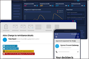
These illustrations were designed to replace screenshots used on the website. They help reinforce the brand and communicate specific features of products without losing effectiveness with unnecessary detail.
View project >
The Egress brand underwent another refresh at the beginning of 2022. The requirements for the brand had been updated, where the brief was to make the brand feel ‘sophisticated’.
View project >
This landing page was created to promote a free product. It was designed purely for conversion- that is to encourage visitors to fill in the form.
View project >


