Brand and Web Design
HLS Digital Expo
There has been a rise in the popularity of digital events, this was particularly true over the pandemic 2020-2021. The Human Layer Security Expo was a biannual digital expo that ran over one day, with various guest speakers talking around a specific theme. This expo needed a distinctive identity which worked alongside the existing brand, as well as an event landing webpage and other materials.
Project goals:
1) To create a consistent identity for an online event.
2) To encourage people to sign up for the event.
Designing the identity
This project had a tight turnaround, and so the identity was created alongside the designs for the landing page. The identity utilised the overall brand colours and was aimed at the same audience, where it needed to appear professional but also able to stand on its own. Below you can see three options which were original designs for identity, as it would appear above the fold on the page (click to enlarge).
Creating materials
The chosen design included a pattern made of triangles. The different years included different main highlight colours, either the coral or the turquoise, as well as a different main character.
Opposite you can see some materials involved in the event, including web banners, an email banner and a presentation slide.


The landing page
The main part of the brief was the landing page. It would also be built and sit on Marketo, where different sections would need to be hidden at different points, and where this Marketo template would allow for additional sections and content to be added (these are shown as grey blocks on the design opposite).
Initial steps included creating a wireframe, to agree the content which was to be included. The most important information was placed higher up the page. All the information needed to encourage registrations had to exist on this landing page, as any external facing links would have reduced conversions.
Above the fold
Key information was placed above the fold on the page. This included CTAs and other information, such as a brief introduction, the time and date of the event and that this was not an in-person event. Ideally there would be an ‘add to calendar’ button, but this was not an option.
CTAs
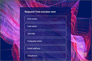
The main purpose of the landing page was to encourage visitors to register for a ticket. It was important that these registration CTAs stood out against any other (anchor) links, so any buttons which did not lead to registrations were not full coloured. As the page is quite long, there needed to be multiple registration CTAs (where the form would appear as a pop-up above the landing page), including one at the bottom of the page (for anyone that scrolls that far).
The registration CTAs had the content ‘get my free ticket’. This tells people that the event is free, but also the wording is more effective according to published research. People respond better to the word ‘my’ than ‘your’ in CTAs. Additionally, non-specific CTAs (such as ‘submit’) see significantly lower conversion rates.
Other CTAs encouraged visitors to share the landing page, in order to encourage further registrations. Mailto links included pre-populated text for convenience.
Video
There is a lot of evidence to suggest that video increases conversion on webpages. Our guest speakers recorded short videos for use on this page and social media, which introduced the topics they would be talking about. When designing this section it was necessary for visitors to be able to select the video they want to watch, and to also know which video they are currently watching.
Social validation
Including items such as quotes and reviews from previous attendees, as well as brands associated with the event, is designed to make the event feel more prestigious and of higher value. This is likely to encourage people to sign up.
Additional content
There is a lot of information to include on this page, so the design needed to include options to reduce this length where possible. The agenda and information about the speakers were designed so that most of the information in these areas would initially be hidden, to limit the complexity and length of the page.
In addition, the template would also need to work for on-demand visitors for when the event was over. This means that the design had to account for that in advance, where links to those recorded sessions could be included.
Want to know more? Get in touch!
Related content
This successful campaign described how employees posed a security risk to businesses in three key ways- employee error, hacking and data exfiltration.
View project >
Creating an internal brand identity, which would sit comfortably alongside the external-facing brand, as well as producing materials for internal campaigns.
View project >
This landing page was created to promote a free product. It was designed purely for conversion- that is to encourage visitors to fill in the form.
View project >


